Sunday, February 27, 2011

Concepts are BACK - Milan Fashion Week Part II


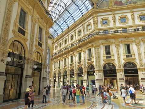
Hey there, I've been making a real effort to see all of the high profile shows this season within a few hours of them happening. The internet is pretty amazing that way. This is Part II of my reviews of my favorite designer collections this season at Milan Fashion Week.

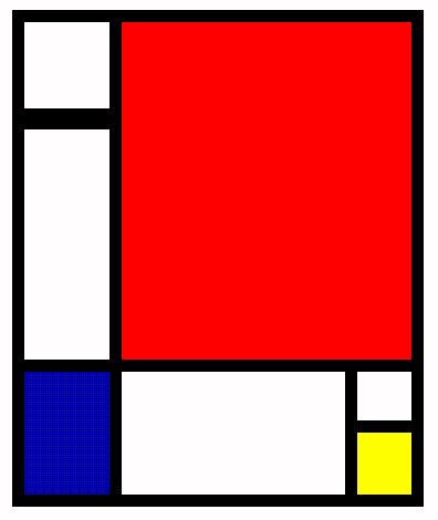
When I first took a look at the Prada collection this season, I was rather shocked at how dissimilar it was to Miuccia Prada’s usual sense of style as a designer. I have to admit that I was rather critical of the collection, citing that it was “not Prada enough,” lacking the curvaceous, femininity of the Prada silhouette. However, I stood correctly once I learned of Ms. Prada’s concept behind the collection of box shaped, geometric, Mondrian inspired pieces. What Prada was attempting to do was explore the idea of womanhood in 2011. The majority of the pieces could very acutely be placed in both 1920s and 1960s fashion spreads, with their dropped waists and straight form lines. Both of the previously mentioned decades were times of great change and growth for woman as a whole, and Prada wanted to nod to this idea of the ever evolving societal view of femininity in fashion. Even with a high luxury brand like Prada.

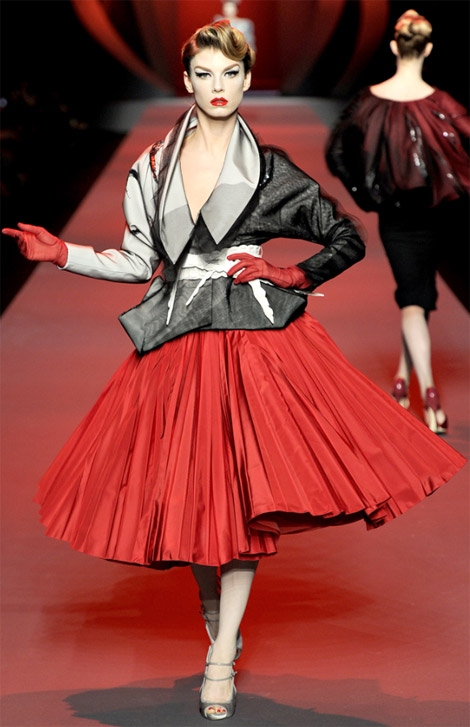
And surprise surprise!! Versace’s show featured oversized geometric prints and box shaped garments with dropped waists!! I must admit though, Donatella always knows how to spin a trend to make it quintessentially Versace. She’s used bright, bold colours similar to the rest of the season to date, but the prints are much more subtle than say… Carolina Herrera’s line in New York. She’ll put a shoulder-sized baroque curlicues, (once a signature symbol of the label) in bright yellow on a black dress, or she’ll synch a straight waist together with a belt and an oversized geometric buckle. Then the leather numbers came. I was so afraid that the entire collection would be the same as all the rest, which is fab, but getting tired quickly, for someone who has been watching all of the high profile shows to date this season. The leather was stunning. I loved each one, and though I don’t normally consider myself a Versace girl, I would rock the hell out of one of these outfits. ;)

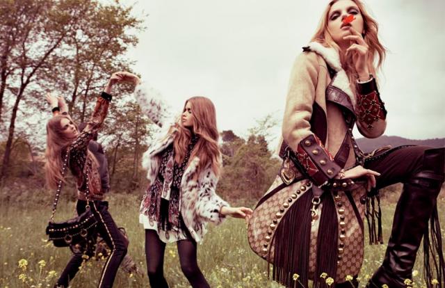
Last but not least for my Milan Fashion Week highlights is the one and only Dolce and Gabbana, one I’ve been eagerly awaiting as a loyal fan. The show opens with a female model is a little boyish outfit wearing a cap with her hands in her pocket. Hmm… I do believe I detect a hint that the designers were going to be stressing androgyny in this collection?? Well indeed, that was the case and the clothes represent two wonderful things to me. Firstly, we have lots of collared shirts and sweaters, pleated pants and caps – in the real world, women love to dress like this. It’s more comfortable, it’s more acceptable these days, and it is just lovely to go out dressed like a boy, walking around like you’re the man in charge. Admit it. Then there were the dresses. Some were oversized, billowy sheer fabrics, reminiscent of imagery associated with witches world-wide. :P Some, on the other hand, were the most beautifully built lace and metallic lame dresses. Always a spectacle with the Dolce and Gabbana shows.

To conclude, Milan fashion week is always a treat because there are so many spectacular Italian designers that no matter what there will be something beautiful to look at. I found that with this season’s most reputable and intriguing designers, there has been a definite growth in the conceptual aspect of the creating of a collection of clothing and the subsequent fashion show. Whether it’s Prada’s exploration of the female spirit or Donatella Versace’s nod to her company’s ancestry by having her show take place in the same venue her brother Gianni had years earlier. Leave it to the fabulous Italians to put the depth back into fashion design.

Until next week, when I review the first of my favourite collections from the most important city in the history of the fashion industry. I have never been so excited for Paris Fashion Week!!

Thanks for reading!

Friday, February 25, 2011

La Moda Italiana – Highlights from Milan Fall 2011

It's Fashion week in Milan this week and today I'm going to discuss the glorious Gucci collection, the ever splendid Fendi furs and the geometrically based neutrals of Gianfranco Ferre. Bella!!

The very first thing I noticed about the Gucci collection this season (it happens to be their 90th anniversary this year) was the dynamic use of texture and colour. The opening outfits were all in a rich blue/green colour, something close to a dark cyan on cerulean. As the collection progressed, the colours became more widely ranged and brighter in nature. There were silks, furs, python and patent leather and a sea of other luxurious fabrics that Gucci, and indeed Italy as a whole has always been known for. The over-sized fedoras said nothing but classic Italian elegance. Can you imagine running into a woman on the street wearing these clothes?? Intimidation to the max. Colour and intriguing fabric use is always something of interest to me and usually makes or breaks a runway show for my favour. It may only be the first show of the week in Milan, but I’m already hooked.

Karl Lagerfeld is a designer who will go down in history as never having had a failed collection for any of the fashion houses he associates with in the history of his career. The Fendi show this season was of course, no exception. Largerfeld is known for his use of unique and not normally used furs with his Fendi line, and fur is a common theme throughout. There are also many flounced collars, (another favourite of Karl’s,) and the colour theme this season emanates prominently. By adding coloured tights to any model’s outfit, the stylist has now changed the entire look from simple a chic to young, vibrant and still chic and simple.

I remember when Gianfranco Ferre got into the industry a few years back. I watched him on fashion television and all anyone could say about him was that he would be the next big thing. He has always been known for his tendency to make a grand gesture with his clothing and this season, following the overriding trend of fashion week, his geometrically based, neutral pallet of designs was not exactly up to his usual standards, in my humble opinion. The collection was beautiful; don’t get me wrong, but the show as a whole lacked a certain grandeur that I’m perhaps used to with this particular designer.


This whole geometry thing that’s happening this season is really interesting. The tendency to use dropped waists and minimal curves coupled with a rainbow of vibrant colours and a sea of the most precious of animal skins is popping up everywhere. History shows that when fashion becomes simplistic in nature, it is usually a result of mass cultural change in the midst. Perhaps you would agree that this trend indeed fits the era in which we currently live. We’ll see if it continues in other collections for the remainder of fashion week! Check me out next time for my review of the Prada, Versace and the highly anticipated Dolce and Gabbana shows in the next few days.


Until then!

Wednesday, February 23, 2011

London Fall 2011 Fashion Week: Geometry, Colour and Prints

London!
Hey cats, I've been ill and out of commission this week, but luckily, it left me a lot of time to sit around and watch fashion shows!! London fashion week is often one of the most highly anticipated events in the industry, in the past featuring designers such as Alexander McQueen and Vivienne Westwood. This season the three most outstanding of the week in my humble, yet meticulously well informed opinion, were those of Mary Katrantzou, Christopher Bailey for Burberry Prorsum and the delightfully unique Holly Fulton.

Mary Katrantzou is not the most well known designer in the world and her creations are far from average. Her Spring/Summer collection featured cocktail dresses made of interior design fabrics, depicting printed and embroidered images of interior scenes and imagery. If not terribly wearable, the clothes are in the very least quite unique.

This season’s line was not far out of that range of description. It was a beautiful show, featuring extremely bright, powerful, Asian culture inspired prints. There were coi fish dresses coloured with bright orange and bright aqua marine. There were also somewhat more muted flower prints in softer colours, but always with the high contrast.

The thing about designers such as these, are that even though they are perhaps not the best sold designers in the industry, they have contributed something very important to it. By contributing to the ever growing fashion dialogue is to perpetuate the existence of the industry itself. Why make a lamp shade shaped dress that no one will ever wear with a giant coi fish on it? Why not?

The Burberry Prorsum collection was shown in the same week that the designer, Christopher Bailey discovered that the company made 13th place on a list of the world's currently most innovative companies. One would expect with news like that that the collection would have been over the top, bold and, well, innovative. However, the Fall 2011 line was much more muted than that, and represented the classic style of the company, paired with Bailey’s use of colour and line movement. Basically, if you’re into coats, (which I soo am,) this is the collection for you.

Some of the key features of the collection are the military influences that are so very British, and the solid colour scheme of orange, black and some simple greens, blues and yellows.

Then came the plaids! This collection shows a bunch of coats using an over-sized, bold plaid that used to be reserved for your common lumberjack, but can now be seen walking down the runways of London. Burberry never disappoints and there is no doubt that this label has not even reached the peak of its greatness at this time.

One of the distinct things I’ve noticed about this season’s collections was the common use of very bold patterns and geometric shapes. Holly Fulton took this idea and ran with it coming up with some of the most spectacularly printed and designed gowns of the season.

I also totally loved the models taking off their shoes in the middle of the catwalk. I prefer unconventionality in my fashion shows, what can I say. This collection was androgynous, it was punk rock, and it was the tops of elegance. She knew it was both important to show pieces which pushed the envelope in order to get critical attention, but she is also evidently aware of the power of the simple black dress. This collection definitely has it all.

I’ll be writing more this week about the new Gucci collection and many other beautiful Italian labels as we drift over for Milan Fall 2011 Fashion Week.

Until then, do check out the above collections, they are quite fab.

Peaceskies,

V

Wednesday, February 16, 2011

Spring in New York - Part II - Fall 2011 Fashion Week Highlights

I started this post about five times but finally I think I can write it appropriately. New York Fall 2011 Fashion week had me on the edge of my seat this week; every day checking Style.com to see the newest in designer goods. I had to work the night of the Marc Jacobs show and I brought my laptop and kept it in the backroom to sneak a peak on my break. (ps. Marc Jacobs was RIDIC.)
Ps. the Rag & Bone show was awesome too. They are one of my personal favorite lines for actual wearable clothes. They are the line that I always want to buy from, the clothes I would actually wear, but my personal style is somewhat boring... so I won't go into it :)
So there are three collections I said I would cover in my last post and they include MJ himself, Rodarte and the immortal Betsey Johnson. But I want to add an analysis of Oscar de la Renta and a few remarks on some of the other noteworthy events of this year's season.


I'll start with the best. The Marc Jacobs collection this season left me with my jaw on the floor in awe of the beautiful silhouettes and innovative fabrics and techniques. Although the first few pieces of the line were a little bit worrying, as the show went on, I got the idea and I could really see the genius of the way Marc put the collection together. It was different looking at it in photographs as opposed to watching the show though, so I suggest you all do this in order to be fully aware of the beauty of this line. It was the concept that got me. It's kind of this, Mary Poppins, single working woman, very classy, very elegant look with the colours of a much darker and harder collection. The music tops it off. You really must see it.

Moving right along to the longest of the fashion shows this season in New York, the newest Betsey Johnson collection. I love Betsey, everybody loves Betsey. This season she continued with her trademark style of outfit styling witht he very bright colours and patterns and oversized prints of Marilyn Monroe. With a collection featuring over ninety complete outfits, however, there was much variety in the sorts of styles that came down the runway. The pieces I loved included the ful, bold flower print dresses and large yellow plaid skirts. Beeeautiful..

Next up is the design duo Rodarte's fall/ winter collection. I was delightfulyl surprised when I saw this show. The fabric textures and colours are just lovely. I noticed more with this collection than with any other the profound influence of the 1940s silhouette. Long flowy gowns and high waist coats with the most eloquent jacket pleats and cuffs I've seen in a while. Rodarte is pretty classic. Every season they appear with really solid, sellable collections of clothing. This year, they surprised me with how good the whole thing was when seen altogether. I would have changed nothing.

I had to mention Oscar de la Renta because this show was the most surprising of all. From a House that is known for their neutral and black colours on sleek, high class evening wear, they present a collection of adorable little fur lined pieces with bold reds and browns in his most youthful and fresh collection in years. I love de la Renta because they are absolutely classic in the fashion industry. You always know it's quality and you always know it'll be a good show. I think this new direction will be nothing but good news for the House's future.

So before I sign out I wanted to say that i was sufficiently impressed with New York's fashion week this year. The colours were bold and bright and contrast was the key word. There was a clear return to a 40s-50s silhouette in many of the colelctions with everything from the stockings to the wide shoulders. Everything was lean lean lean and the fabrics seem to have an overall heaviness that tie it all together. Beautiful stuff.

Sunday, February 13, 2011

Spring in New York: Fall 2011 New York City Fashion Week Highlights

I've really got to make a point to go to NYC for fashion week some coming year. Much like its European counterparts in Paris, London, Milan etc, New York City Mercedes-Benz Fashion Week is rarely a disappointment. All of North America looks to the guidance of this creative melting pot for the latest, most innovative, most avant-garde clothing available. At this moment in time – February 13 – we are right in the middle of Fall 2011 NYC Fashion Week. From just the first three days of events, these are some highlights I personally liked from designers such as Cynthia Rowley, Alexander Wang, The Row, Marc Jacobs, Rodarte and Betsy Johnson.

Cynthia Rowley is always a collection I make a point of checking out every season. This time around she featured what appear to be velveteen or velour coats and gowns paired with everything from Lycra to full sequins. But the one thing that stood out the most in this collection was the designers unique take on the industry's Alexander McQueen inspired obsession with geometric shapes and digitally generated prints. The almost 3D appearance of these skirts is eye popping to say the least.

Who better than Alexander Wang to do a show loaded with futuristic lighting, black shiny fabrics and stunning wide heeled shoes. I normally shy away from designers who make clothes only in neutrals because I don't understand the vendetta against colour, but Wang is usually an exception to this rule. His soft, matte base fabric paired with Lycra lapels all in black screams texture contrast and really works throughout the line. Throw in a few shredded silk gowns and you've got yourself a winner. And he manages to pull all of this off with models wearing their hair in loose buns on the backs of their heads. Simple.

The Row is a young fashion house started for a very exclusive clientele managed and designed by none other than fabulous Mary-Kate and Ashley Olsen. Normally I am not an advocate of the whole actor turned designer thing... but I feel like Mary-Kate and Ashley are a huge exception to this rule. I'm mostly impressed with the fact that they didn't just decide they wanted to make clothes and use their fame to create a label - they actually paid their dues like the rest of us and attended NYU for Fashion Design. Love it. Anyways with this collection, like the rest of the season, it seems to be all about colour and pattern. The bright yellows paired with soft grays were a great contrast with the full leopard print coats and bright blue fur. What really killed me though was the hats. How these women managed to make a giant ball of fur on ones head look elegant, unique and utterly stylish, I'll never know.

Keep checking these shows out and I'll have more info on the collections of Marc Jacobs, Rodarte and Betsey Johnson in the next post.

Peace for now!!


Saturday, February 12, 2011

Clothing Details: Pockets, Buttons and all the Lovely Embellishments

We at Petey the Troll apparel have been making clothes for a few years now and have noticed a few things about the types of clothing that sell and the types of clothing that remain ion our closet of beautiful, but rejected clothing items. I've been very focussed onconcept of coats and jackets recently and have been looking at various styles represented by in lots of different designers' collections. Most consumers never really think about the reasons why they are buying something, they just like it. I like to look at why people like little details and embellishments on their clothing and what the utilities and design features mean to the consumer. This is the kind of detailed stuff I love about fashion and the reason why I think that even if I get old before I get famous, I could at least be the best damn seamstress there is in the haute couture industry. *Dreams*

Something very specific I've noticed about the way people shop, is they like their clothes to be stylish, but they also require utility in order for it to be considered a sound purchase. Example: My failure to recognize the crucial importance of pockets to jackets and coats has cost me a lot of sales I would have otherwise had. People need pockets in their jackets and coats with few exceptions to this rule. Even if they are barely functional, people need them there to know that if they need to carry something small, they can.
PS. I'm totally in the process of adding pockets to every coat and jacket remaining in the Petey Collection.... We'll re-post everything when the new web sites arrives in a few weeks. :D

The next most important design feature in a well designed, well tailered jacket or coat is the buttons. Okay, I have a weird thing about coats with buttons versus coats with zippers. I would almost like to say that I would exclusively stick to buttons when designing a coat with some exceptions being Vietnam era military style coats (my fav. coat this winter in a chocolate brown felted wool with epaulettes and four front pockets,) and sports coats...which are really designed for a specific purpose and don't count so much. I love buttons though, I'll be the first to spend 8 hours hand sewing button holes on the back of a wedding gown just because the look of a million buttons is akin to the look of pearls - styled perfection.

Embellishments on clothing have had a habit in fashion of coming and going in and out of the height of style. For example, in 19th Century Paris, the more adornments a woman was dressed in, the more money she was thought to have. Women would go great lengths to cover themselves in feathers, ribbons, jewels and whatever else was in style that season. In the early 1920s Coco Chanel decided she wanted to return to minimalsim. She introduced the corset-less dress and the women's suit jacket and changed the way women wore clothes forever and ever. She was no doubt, being influenced by some of the changes that were occurring in the world or art and architecture in Europe. I think of this as the time when the basic box sky scraper building becomes popular world wide and the most avant garde artists were creating high art out of simplified shapes.
Right now in fashion I can definitely say that people are on the simplified end of the fashion spectrum. I get on the subway and 90% of the coats are black black black. Did I mention about 75% of those black coats are Canada Goose? Ridiculous.
I plan to change all that.
Think about embellishments the next time you're on the street and see all of the boring coats. Imagine giant green buttons or purple trim.
Change it up and put the colour and style back in winter! :D

Thursday, February 10, 2011

When Life Gives you Lemons, Smash Them: The Next Step for Petey the Troll

Since we started at the Academy not more than 6 weeks ago, we knew nothing of the world we've been trying to break into for our four years in production as Petey the Troll Apparel. It was obvious to us, before our arrival in Toronto that it would be a bigger challenge to get noticed than it was in Windsor. But here we came, and here we are and now we've realized it's time to take matters into our own hands as opposed to relying on contests, traditional fashion weeks or anything of the like.

I started this blog months ago now with the intention of creating an outlet for my own creative frustrations, successes and assessments of the industry I so aspire to be a part of. It is also meant to display to our followers, clients and admirers every part of our process as we climb the fashion ladder. Your support is immeasurable to us and our further development as a label. Thank you!

So after much examination of the current direction in which Petey is heading, Meaghan and I have decided to change things around a bit for the benefit of the business. No, I'm not talking about sourcing to China or anything like that, I mean we're taking things in a different direction than we were before. I will not be able to go into detail here for obvious reasons, but I can give you an idea of some of the changes you'll see with Petey the Troll over the next few months.


Firstly you may have noticed that our Headquarters – www.peteythetrollapparel.comhas been down for some time now. We'll be replacing it soon with a new and better website, just as soon as we get our ducks in a row. We're aiming toward implementing an online store and somehow attaching this blog to that site etc etc....... computer talk bores me, sorry. Oh yes! The reason we're changing the site is to accommodate the new sparkly name of the company!

Yes! We're changing our name. Don't worry! It'll still include the Troll and the Petey, but it is going to be more directly related to our new business plan to become more of a speciality line than a broadly based line. Aka: we're going to stop making all kinds of different types of clothing and start focusing on one or two types. You'll see, I'm bad at explaining it.

We're also going to make an effort to use our Couture line as more of an artistically expressed collection for the purpose of either theatrical entertainment, or physical art to be displayed in a gallery setting. Meaning we're not going to display the Couture clothing in the traditional fashion runway style anymore. We're going to find new and BETTER ways of displaying our intricately designed and created gowns and wearable art.

Okay so that's the update, Petey is in a transitional period. Why have I explained all of this? Because I like my customers to know what's going on and to walk with us up the big scary fashion industry ladder, straight to the top.

Thank you for your continued support as always,

VPH

Monday, February 7, 2011

Le Couturier: Origami, Fashion-gasms and "Un-Wearable" Clothing

I love this time of year. I'm not talking about the horrifying weather or the desperate feeling that Spring will never come, but the fashionable cure for all of those woes at the end of January/beginning of February - the new Spring Couture Collections. Our own line, Petey Couture (a line we created for the purpose of creating wearable art,) is released in April to accomodate Alternative Fashion Week. I find it kind of perfect thought because as we create the pieces for our own collection, we're viewing the newly finished masterpieces from the House of Chanel, the House of Dior and other fab fashion houses all over the fashion world.

I spent the entire day yesterday and today sketching, pattern drafting and creating little paper, origami flowers for one of my dresses for the Couture line. It's called a Kusadama Flower and it's pretty simple to make, but it involves a lot of patient cutting out squares and gluing little bits of paper together. I'm only alright with it because I know it'll be stunning on the final pieces. I also figured out how to make fabric swirl the way I want it to on the front a dress without actually changing or losing the structure of the garment. Yayyyyyyyyyyyyyyyyyyyyyy.

I didn't have to work today, so I decided to take my time and make flowers all day while doing my laundry and grocery shopping. It's a nice day off from the regular rush of day to day life. I've spent a lot of that time philosophising on love with John and Yoko in the 1973 documentary of the making of Imagine "Gimme Some Truth" (amazing,) and now about life and fashion with Karl Lagerfeld in the recently recorded French documentary "Lagerfeld Confidential."
I find it difficult, while watching John and Yoko in all their glory talking about life frankly in a way they've always been admired for. I think about the relationship to that type of lifestyle as opposed to the lifestyle I've chosen - an unashamed, slave to fashion and art. The unfortunate argument about Couture is its relevance to society in today's context. I believe the answer to this argument is that Couture is for fashion, what the symphony is for music. It is loved for its greatness and only the very best of the industry with the most talent and the most respect can partake in the trade. The symphony is not widely attended in most cases, and exists as a tribute to truly high quality music. I always think of my dad's response to Couture (my father is the epitome of Canadian, mid-fifties father...) which is only that the clothes are "un-wearable" and therefore useless as a sort of fashion. I mean, really, fashion is the most frivolous industry in the world, but why is it that in our over-capitalized world we must take our frustrations with frivolity out on fashion? Let us have our fun, will you?

I'm also trying to find a couple more models for the presentation of the Couture line at FAT this Spring. I think it's pretty obvious from our past photo shoots and shows that we do not tend to use models that are conventionally perfect looking or model like. I'd pick a girl with pretty eyes and an ass over a twig with a plain face any day. So if you think you have a unique look, or you know someone who might fit in with our style, email me at vanessapetey@gmail.com for more info!!
So for now, check out the following Couture collections and keep reading this blog for Petey Couture updates over the next couple of months! Hello February!!

Christian Dior
Chanel
Jean Paul Gautier
Valentino

Until then,
V

Wednesday, February 2, 2011

Neo-Hippie-dom: The Fashion Rebellion You Can't Help But Love

They're a little bit hidden by the snow right now here in lovely Toronto, but they're there. we all see them on a day to day basis at the park, at the local organic food grocer, at the Kensington Market consignment shops. They're the neo-hippies, and they've taken over.

I love them personally. I see the chick with the braided hair carrying her baby in a sling wearing a full length tiered skirt and I say, yes ma'am, you've got it right. They aren't afraid of the great and powerful "INDUSTRY" and they've been wearing the same types of clothing for years and years. This is the opitomy of a trickle across effect occurring with a particular trend in fashion. There have always been and there always will be groups of people who believe the trees should be saved and eat vegan and would NEVER drive and they carry large paintings or awkward rulers on the streetcar (Okay. I may be known to carry large bags of clothing and awkward rulers on the streetcar... but I'm in fashion, so it's better... right?)

You can call them hippies, tree-huggers, flower children, bohemians or beatniks. Or perhaps you're more partial to the close social type cousin of the hippie, the hipster. Often these types are slightly more booky/arty than earthy/natural-y.
Remember those amazing Guess ads with the chicks in fur and the hippie garb? Nothing like a brown suede fur lined, leather trimmed fitted military jacket to really finish an oufit off. Not to mention the fabulous dresses and bags that came out of that hippie-chic inspiration.


So why has a trend like this lasted so long? Why are there still thousands of people who smoke lots of weed and wear maxi dresses and get dreadlocks and don't bath for long periods of time? Maybe they see the nostalgia of the 60s as something desirable and they try to imitate what they admire. Or further yet, maybe they are under the impression that what they're doing is actually original and unique and they are proud of their hippie-dom and pronounce it with their style. Either way, it has showed up on runways periodically and it will always be one of those trends that comes back around again and again.
Did you ever hear your mom say "Aw i shoulda kept those old jeans I had, you'da loved em Ness."
Perhaps not exactly like that, but close.